Today I attended a presentation put on by Xerox and EFI. Two topics discussed in this presentation were variable data printing and web to print/digital storefront.
The section about variable data printing was very helpful, because it helped me to develop ideas for my next Digital File Preparation assignment, which is a variable data project. It was stressed in this portion of the presentation that variable data is a very effective tool to promote a company. As a consumer, I have oftentimes thrown away junk mail or deleted emails that I felt didn't pertain to me. By using a database to organize customers for a business, the business is able to distinguish which customers are likely to respond to an advertisement, be it in print or in an email inbox. When using variable data, however, it is important to make sure you get your facts right so you're not wasting time and money on a piece that will not be responded to.
The second portion of the presentation was regarding web to print and digital storefront. This section didn't pertain as much to me currently, but will be helpful in the future. Web to print enables printers to set up a web site using a template provided by EFI. This web site allows customers to easily create their own business cards, flyers, etc. from templates provided for them. This process creates an easy revenue stream for the company and makes the creation of documents easy for customers.
Overall, the presentation was very helpful and provided information on cutting edge trends in the printing industry.

Thursday, October 28, 2010
Tuesday, October 19, 2010
strum & crumb
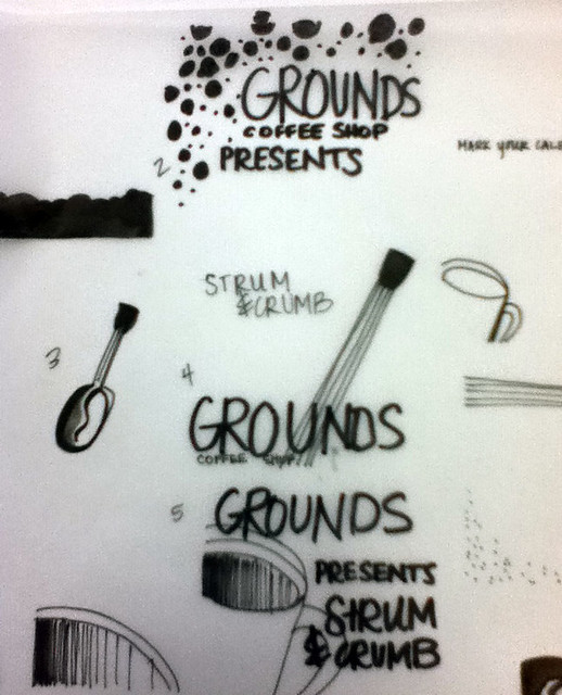
Original sketches and ideas.
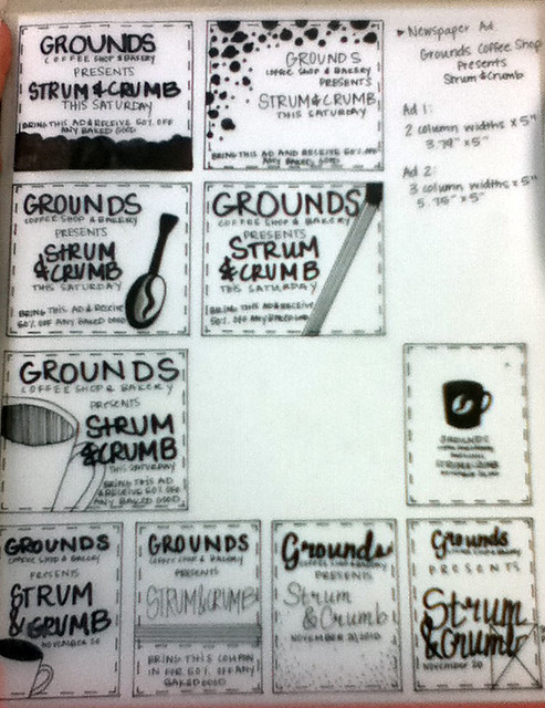
Thumbnails
Rough One (large ad)
Rough Two (small ad)
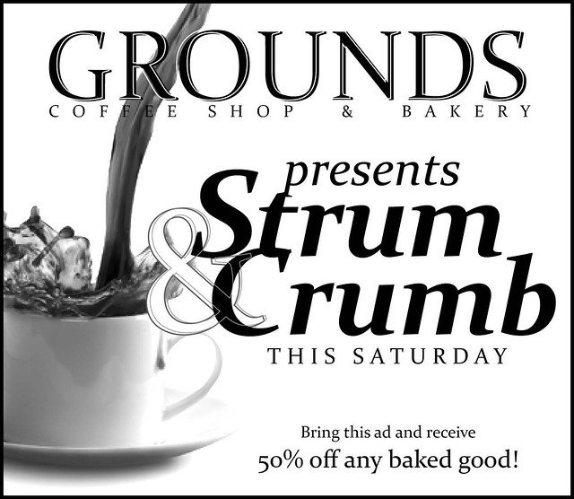
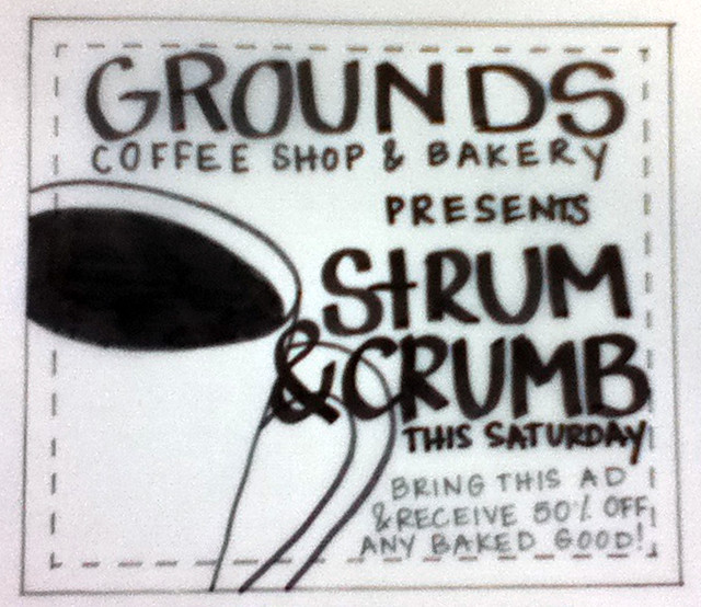
Large Ad, Finished.
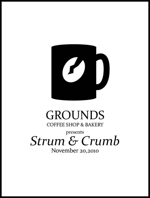
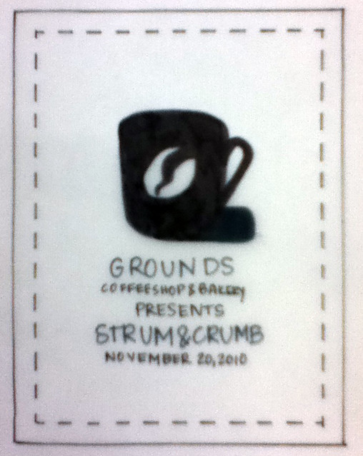
Small Ad, Finished.
Newspaper Advertisement Project Specifications
(written before starting on original sketches)
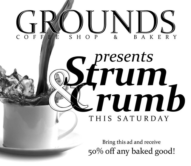
The newspaper advertisement I have chosen to design is for a fictional coffee shop – Grounds Coffee Shop and Bakery – having an event called Strum and Crumb, a night of acoustic music and discounted baked goods.
The target audience for this event includes 16-30 year olds – high school upperclassmen, college students, and twenty-somethings. It is targeted at both males and females. The socioeconomic status of the target audience is middle to middle-upper class people; these individuals are likely to have spare money to spend on entertainment. However, the baked goods for the night are discounted, so it also will appeal to college students struggling with money management. This event and the advertisements themselves are designed to appeal to local Pittsburg residents because it includes local music artists. The culture it will appeal to includes people who consider themselves trendy.
The call to action for this newspaper advertisement is first and foremost to attend the event. Secondarily, viewers are called to bring the coupon in for a discount, which will provide the business with a return on investment.
The budget for this advertisement is one hundred dollars. I have chosen to develop a campaign of two separate advertisements that will appear in the newspaper two weeks prior to the event and one week prior to the event. The first ad will be 3 column inches by 5 inches and the second will be 2 column inches by 5 inches. Together, the ads cost exactly one hundred dollars.
Monday, October 18, 2010
roasted tomatoes gourmet pizzeria
This project is somewhat near and dear to my heart because the original assignment was for the class to come up with ideas for either real or fictional logo projects we could work on. One day, out of the blue, I thought of Roasted Tomatoes Gourmet Pizzeria, a fictional restaurant I envisioned as an upscale, trendy dining experience.
Out of the ideas the instructor received, one of the three chosen was Roasted Tomatoes, which was really exciting because I had a lot of ideas running around in my head for the logo design.
Here is the entire process:
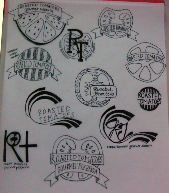
Original thumbnails. Pretty rough at this point.
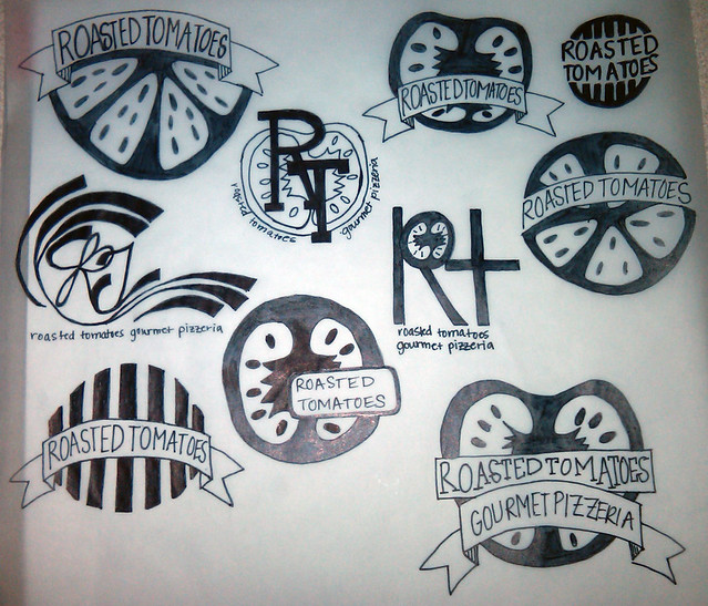
Finished thumbnails to be handed in in class.
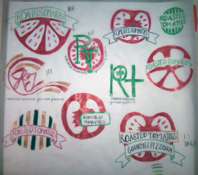 Finished color thumbnails including votes from the class for which three color thumbnails should be taken to the next step: roughs.
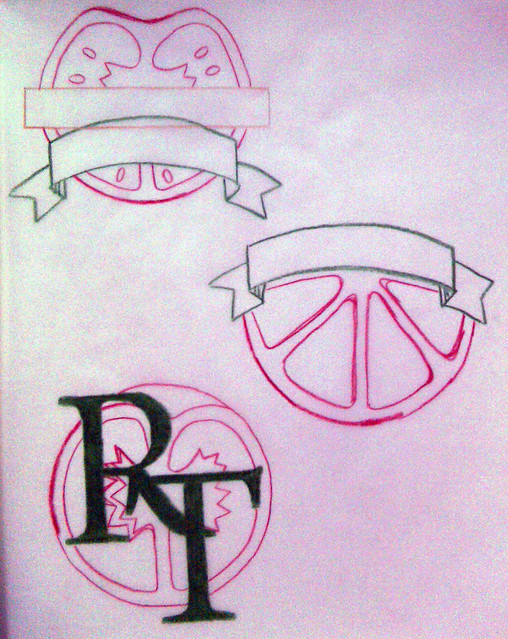
Working on roughs.
Finished roughs.
Black tracing of finished rough of favorite logo design. This image was used as a template in Illustrator for creating a computer generated file.
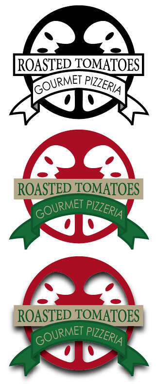
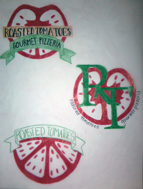
One color, three color, and full color logo designs.
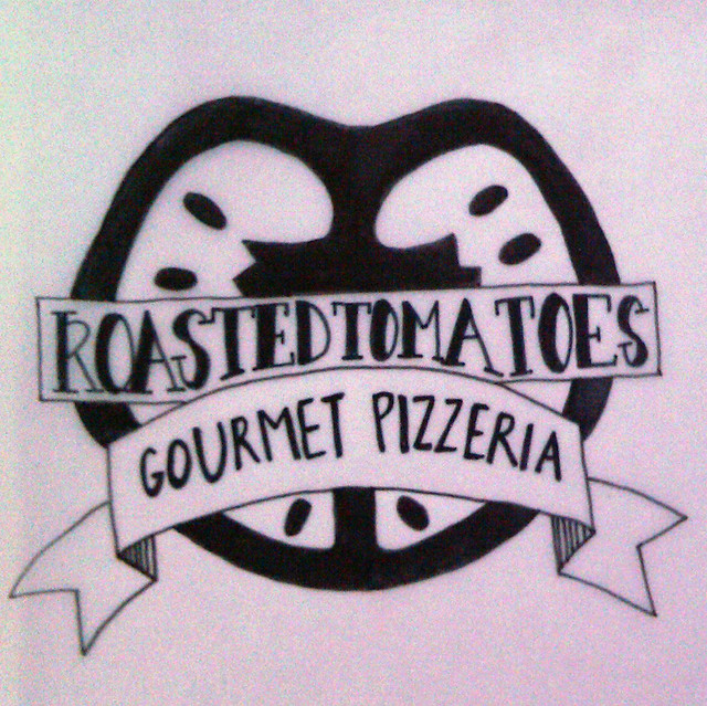
Finished product.
Out of the ideas the instructor received, one of the three chosen was Roasted Tomatoes, which was really exciting because I had a lot of ideas running around in my head for the logo design.
Here is the entire process:
Original thumbnails. Pretty rough at this point.
Finished thumbnails to be handed in in class.
Finished color thumbnails including votes from the class for which three color thumbnails should be taken to the next step: roughs.Working on roughs.
Finished roughs.
Black tracing of finished rough of favorite logo design. This image was used as a template in Illustrator for creating a computer generated file.
One color, three color, and full color logo designs.
Finished product.
Friday, October 15, 2010
nowhere leads to somewhere
Today, Pittsburg State University had a very special visitor. Brendan Murphy, senior partner and designer at Lippincott in New York City came to speak. Murphy is considered by the school and myself to be an "outstanding alum" and I was very happy to get to hear him speak about his experiences in the graphic design field.

I was inspired by Murphy because while I know I'm receiving a fantastic education in graphic design at Pitt State, I can imagine that people from NYC may not necessarily see it the same way. Murphy has proven himself through his abilities, (which he learned, or at least set a strong foundation for, at Pittsburg State University) not his diploma. I was also inspired by his thesis project for his Master's at Cincinnati University, where he redesigned the handicap symbol. While speaking today, he emphasized that the logo should represent "access" instead of "handicap." I felt that it was inspiring that such a seemingly small update to a symbol we see every day could make a difference to a mobility-impaired person.

I think of myself as a lifelong learner, and today was definitely a great opportunity to expand my knowledge of graphic design and "the industry." The most helpful portion of Murphy's presentation today was when he spoke in detail about all the steps in branding or rebranding a company. One very interesting thing I learned was that, in the development stage of creating a logo, anywhere from three hundred to three thousand ideas are sorted through to find only one logo that makes the cut.
Murphy was also full of helpful advice such as the following:
• Have values
• Relate to people
• Nowhere leads to somewhere
• Anytime there's change, there will be opposition
I was inspired by Murphy because while I know I'm receiving a fantastic education in graphic design at Pitt State, I can imagine that people from NYC may not necessarily see it the same way. Murphy has proven himself through his abilities, (which he learned, or at least set a strong foundation for, at Pittsburg State University) not his diploma. I was also inspired by his thesis project for his Master's at Cincinnati University, where he redesigned the handicap symbol. While speaking today, he emphasized that the logo should represent "access" instead of "handicap." I felt that it was inspiring that such a seemingly small update to a symbol we see every day could make a difference to a mobility-impaired person.
I think of myself as a lifelong learner, and today was definitely a great opportunity to expand my knowledge of graphic design and "the industry." The most helpful portion of Murphy's presentation today was when he spoke in detail about all the steps in branding or rebranding a company. One very interesting thing I learned was that, in the development stage of creating a logo, anywhere from three hundred to three thousand ideas are sorted through to find only one logo that makes the cut.
Murphy was also full of helpful advice such as the following:
• Have values
• Relate to people
• Nowhere leads to somewhere
• Anytime there's change, there will be opposition
Thursday, October 14, 2010
old vs. new
Google News lists 633 news articles related to the new Gap logo. The release of the new logo less than a week ago caused an uproar on the web, especially on social networking sites such as Twitter and Facebook. Gap smartly listened to the dissatisfaction of their target audience and scrapped the new logo within a few days. This is definitely to their benefit, because a target audience unhappy with the brand's image will be less likely to purchase goods from the Gap.
So why exactly did this rebranding cause such pandemonium on the web? First of all, the new Gap logo was awful. I believe they were shooting for a simple, clean, well-designed look. Instead, the logo is simply boring. Furthermore, it looks like something that could have been created in Microsoft Word by a middle schooler. Additionally, Gap is considered by the target market (including myself) to be a traditional brand. They sell traditional, simple, timeless, cool clothing. The original logo conveyed all of this. It was easily recognizable, as it has been for the past 20 years. To get rid of such a recognizable icon, Gap also got rid of quite a bit of brand equity that went along with the traditional logo.
I assume the reason for the new branding was to give Gap a new, fresh appeal in a market that is less than stellar. Surely they hoped that the new logo would lead new customers to their store, adding more profits. However, a new logo means new bags, store signage, etc., and these extra costs really defeat the purpose in this case.
After all this turmoil, I have to wonder if maybe, just maybe, Gap has some clever ploy hidden from the general public. Perhaps they did this all on purpose. It stirred up so much controversy that the Gap gained a lot of publicity. Maybe they purposefully designed a logo so awful that they had no choice but to take it back, while still enabling the logo to cause enough of a stir to catch the public eye.
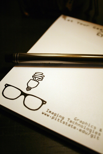
recruitment notepad
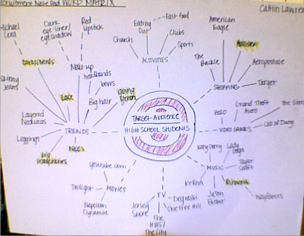
I began brainstorming for this design through a word matrix, focusing on my target audience, which is high school students.
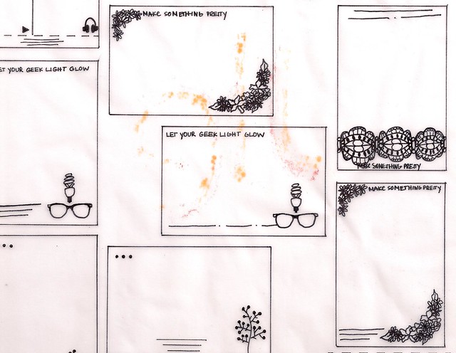
After some very rough sketches, I refined my ideas into thumbnails.
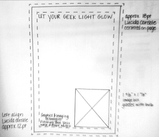
When I had chosen the thumbnail I felt was the best option, I made a rough. This rough helped me to easily lay out my design in inDesign.
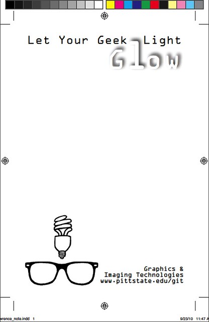
Just before going to print, here is my finished PDF.
At this point, I took my PDF to a print shop to receive my price quote. Each notepad was quoted at fifty cents, a very economical price.
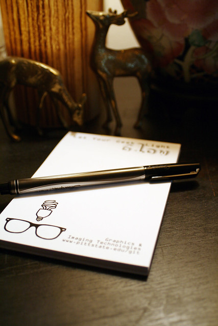
Finished product
Finished product
Synopsis
The target audience for this piece was high school students. In the "Trends" category of my word matrix, I wrote "dorks/nerds." This was especially inspired by popular actors such as Michael Cera. Following this trend, popular accessories in stores like Claire's and Target include clear, black horn-rimmed glasses. I decided to use this trend in my recruitment notepad as well.
The purpose of this notepad is to lead high school students to think that the Graphics and Imaging Technologies Department at Pittsburg State University is trendy, which might make them want more information about the program. The notepad leads them to the Pittsburg State University web site, where they can find the information they're looking for.
Design elements used in this piece include visual hierarchy, continuation, white space, and balance. The eye is first drawn to the glasses and bulb graphic, providing visual hierarchy. The light bulb points up to the header text, which provides continuation. There is white space in the design in the area where the notepad will be written on. The balance in the design is achieved by placing the two largest objects diagonal from each other and smaller text also at a diagonal.
The glasses and light bulb graphic is mine. It was first drawn, then scanned in as a bitmap image that has been further edited in Photoshop for clarity.
Wednesday, October 13, 2010
Subscribe to:
Posts (Atom)